ROLE
UI DESIGNER / Vector Artist / GAME DESIGNER
|
|
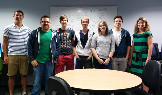
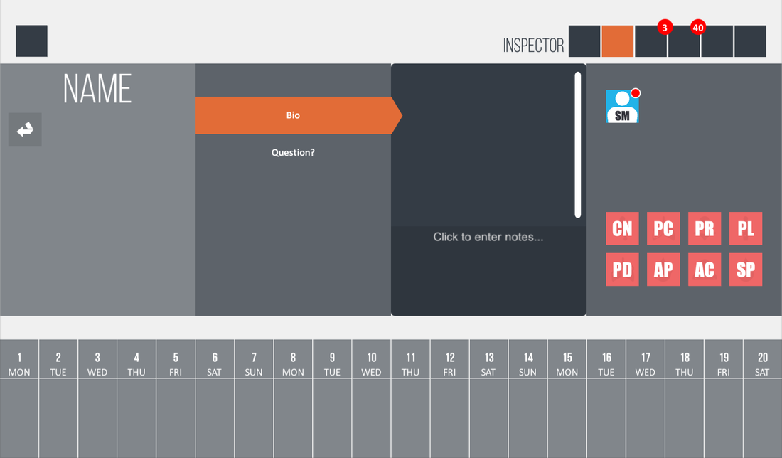
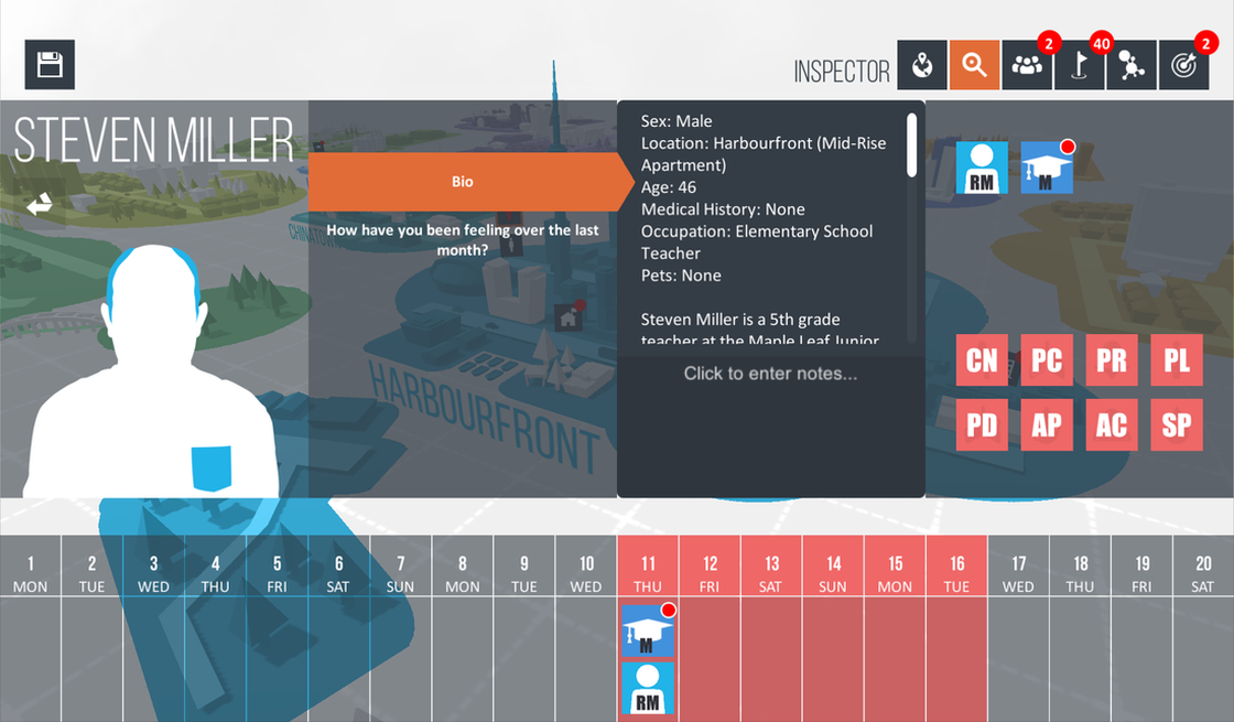
The fully shipped educational game was made for the faculty of humanities & social sciences at Sheridan College. A team of 4, designed and developed the game over the course of summer 2015. The game places the player in Toronto, Ontario were they are asked to investigate a deadly outbreak. The player must find and talk to different people and reference there disease chart to piece together what exactly in going on. Slowly expanding their knowledge, they will use this game to produce a final paper analysis. This game allows player to dive into and gain basic knowledge in the fields of epidemiology, biological anthropology and medical anthropology.
Process
One of my main jobs while working on Epigame was to try and visualize not only what the final game would look like but also how the final game would play. As the client did not have a game industry background, she had a hard time foreseeing many of the concepts that our team was pitching. Therefore, I created mockups and storyboards in order to demonstrate to the client the flow, pacing, and the different teaching aspects of the game. These concepts also aided our team to stay on the same page as we constantly referred back to them when communicating our though process.
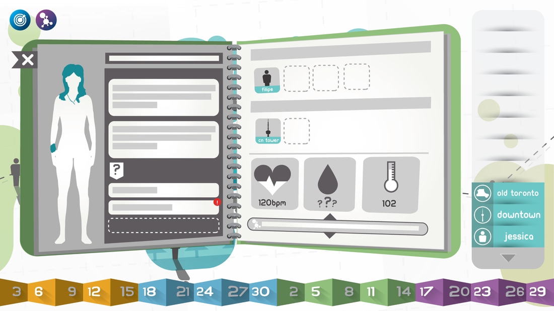
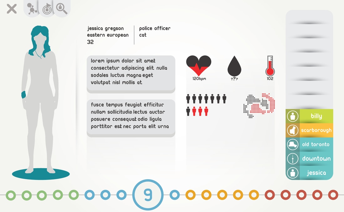
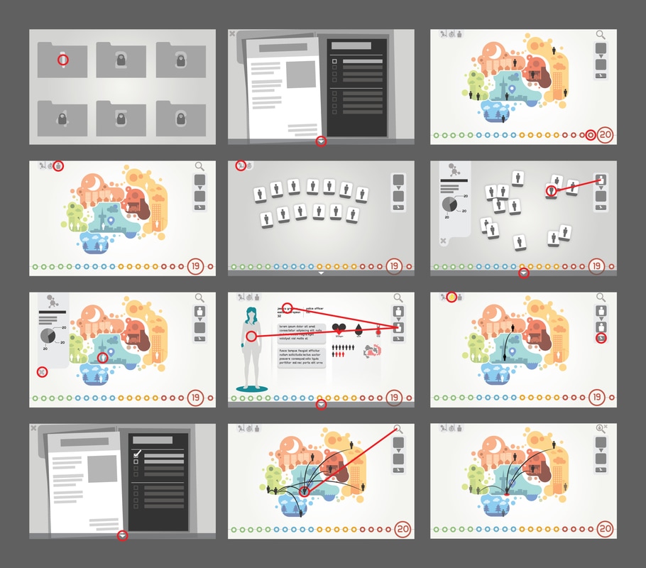
Character Tab

|
|
The character tab went through much interaction as the game progressed. These mockups were made in attempt to establish a visual language for the UI in terms of flow, pacing, hierarchy, and color. This process was repeated many times in order to refine different aspects and reflect the current state of the game as it evolved.
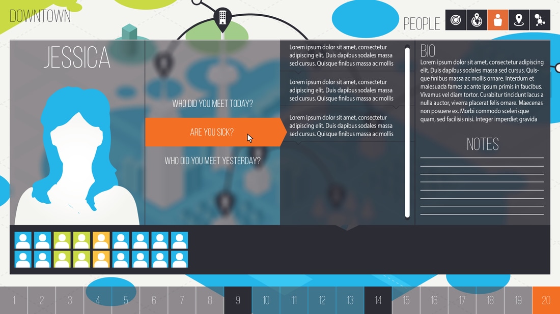
Storyboards
|
Storyboards were often created to visualize how the player might interact with not only the UI but also the game. These storyboards were used to aid in establishing the games flow and pacing.
|
User interface Style Guide
Core Pillars
FUNCTIONALITYUI should only be on screen if its serves a purpose. All UI on screen should be relevant to the player at that given time.
|
CLARITYUI should allow players to find and process the information they need as quickly and easily as possible. UI should always be clearly displayed and readable under all circumstances that it is able to appear under.
Vertical Divider
Vertical Divider
|
ConsistencyThe flow and interactions of UI schemes should be consistent across all forms of the UI. The UI should come natural to the player.
|
Visual Elements
|
Shapes & ArrowsBasic shapes define and encapsulate interaction points. Opacity and arrows are used in order to enhance clarity and navigation. Different opacity values aid in creating a strong focal point while also leading players through the UI scheme.
|
Color
Primary ColorsBlue & orange should be used throughout most the UI to promote consistency. Blue represents the UI is unselected or neutral, while orange indicates a selected or active state.
Vertical Divider
|
Secondary ColorsSecondary colors are used ether to create context or put emphasis on existing information. Secondary colors further enhances the UI's understanding and focus.
|


Font
|

A Thin typeface used for displaying large titles. Only used at larger scales as lower scale values cause legibility problems.

Medium sized typeface used for displaying tabs, headers, and titles at a lower scale value.
|
Iconography
Iconography are used to keep text to a minimum within the UI. Icons aid in clarity as they should be able to be understood and recognizable quickly. Icons should maintain there legibility and be clear at small sizes.
|
|
|
|
|
